Bathroom Color Palettes That Feel Calm And Modern
A calm, modern bathroom isn’t just about what colors you choose; it’s about how you use them.
Color affects mood, light, and even the way a space feels in scale. A well-chosen color palette can make a compact bathroom feel open, spa-like, and serene, while poor color balance can leave it feeling cold or chaotic.
In this guide, I’ll walk you through the color palettes and design principles that make bathrooms feel calm, cohesive, and beautifully modern. Whether you prefer minimalist whites, warm earth tones, or nature-inspired greens, these ideas will help you create a space that feels both timeless and personal.
In a hurry? Here’s my key takeaway:
🛁 Calm bathroom design isn’t about choosing “light colors.” It’s about balance, subtle contrasts, tactile textures, and lighting that flatters every surface.
Read on to learn more…
You May Also Like:
Biophilic Bathroom Design | Advice, Ideas & Everything Explained
Start With the Mood You Want to Create
Before picking paint or tile samples, step back and ask:
“How do I want this space to make me feel?”
Your answer should guide every design choice.
- Spa-like retreat? Think soft whites, warm neutrals, and organic textures.
- Crisp and contemporary? Cool greys and pale blues feel fresh and clean.
- Earthy and grounded? Clay tones, soft taupes, and muted greens create depth and calm.
Mood drives palette, and palette drives materials. This ensures your space feels intentional rather than pieced together.
💡 Designer tip: Choose a single “mood image” (a photo or inspiration board) and refer back to it while you plan. It helps you stay consistent when faced with endless tile options.
Understand Light and Undertones
Lighting changes everything about color, especially in bathrooms, where natural light is often limited.
A cool grey tile may look sophisticated in daylight but turn icy under LED lighting. Similarly, creamy neutrals can appear yellow if the wrong bulb temperature is used.
📋 Lighting and color checklist:
- Test paint and tile samples in both natural and artificial light
- View samples at different times of day
- Use warm white lighting (2700–3000K) for soft, flattering tones
- Match warm colors with warm light, and cool tones with cooler light for harmony
If your bathroom has no window, consider layered lighting (ceiling + mirror + accent) to simulate natural balance.
💡 Pro tip: Always test your chosen paint or tile next to your vanity and floor material, not on a blank wall. Context changes everything.
You May Also Like:
How To Choose Bathroom Grout Color | Small Decision, Big Impact
The Best Calm and Modern Bathroom Color Palettes
Below are five color families that designers return to again and again for calm, modern bathrooms, each versatile enough to adapt to different home styles and sizes.
Palette 1: Soft Neutrals

Colors: Warm white · Oatmeal · Sand · Taupe
This palette never goes out of style. It feels soft, clean, and timeless. Perfect for small bathrooms or homes seeking a spa-like atmosphere.
Pair pale stone-look tiles with whitewashed oak or natural linen textures to create an effortlessly layered look. Add warmth through brass or brushed nickel tapware.
🪵 Material pairing idea: Combine microcement walls, soft travertine tiles, and woven accents (like rattan baskets or linen towels).
Works best with: Brushed nickel or light brass finishes and warm LED lighting.
Palette 2: Cool and Clean

Colors: Pale grey · Misty blue · White · Brushed steel
Cool tones feel sleek, modern, and quietly luxurious. This palette works beautifully in contemporary homes or bathrooms where natural light is abundant.
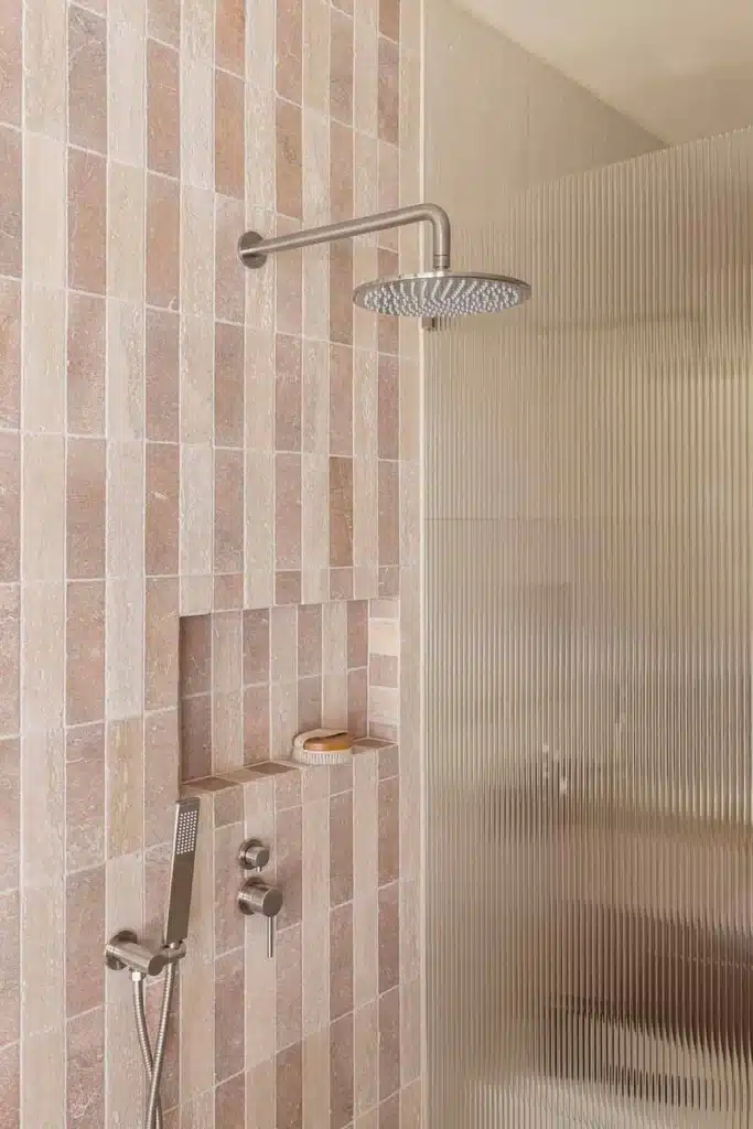
To keep it from feeling sterile, focus on texture: matte tiles, frosted glass, or fluted ceramics all add warmth without color.
💡 Designer pairing: Combine pale concrete-look tiles with white cabinetry and polished chrome fittings for a crisp, architectural feel.
Works best with: Chrome or matte black fixtures, linear lighting, and frameless mirrors.
Palette 3: Earthy Warmth


Colors: Clay · Beige · Terracotta · Soft wood tones
This palette brings warmth and calm to modern design. Think grounded, organic, and tactile, inspired by sunbaked tones and natural timber.
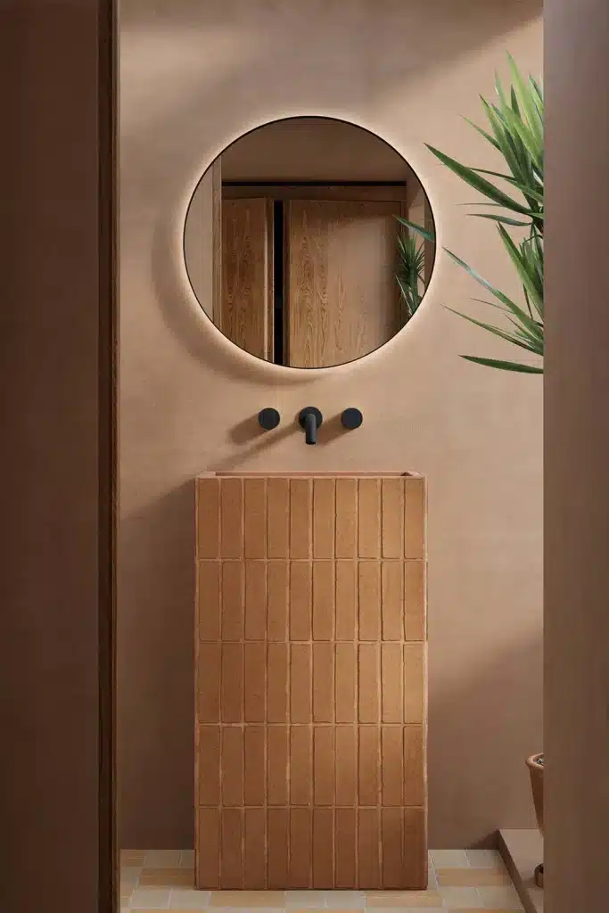
Clay-toned tiles and warm timber vanities create a relaxing, cocoon-like feel, while stone basins or handcrafted ceramics add character.
💡 Designer tip: Combine matte terracotta tiles with brushed brass fixtures and warm lighting for a boutique-hotel aesthetic.
Works best with: Brushed brass, bronze, or aged gold hardware.
Palette 4: Monochrome Minimal

Colors: Charcoal · Off-white · Pale grey
Done right, monochrome design feels elegant, modern, and calming. The trick is contrast and texture. Think matte black fittings, off-white walls, and subtle stone veining.
To soften the look, introduce warmth through natural materials like timber stools or woven accessories.
💡 Designer pairing: Use charcoal floor tiles with soft grey walls, white sanitaryware, and a timber vanity to keep the palette grounded.
Works best with: Black, gunmetal, or brushed steel details.
Palette 5: Soft Greens

Colors: Sage · Olive · Cream · Light wood
Soft greens are perfect for creating a natural, restorative bathroom. They evoke the calm of nature without overpowering the space.
Sage tiles, white walls, and oak cabinetry form a beautifully fresh palette. Add texture through marble-effect tops or ribbed glass.
💡 Designer tip: Combine soft green with brass lighting and warm LED glow for a modern yet soothing finish.
Works best with: Brushed gold or oak detailing, and warm, indirect light.
Add Depth with Texture and Finish
Color sets the tone, but texture makes it feel alive.
Even a simple palette can look sophisticated when you layer finishes.
✅ How to add texture and depth:
- Mix matte and gloss tiles in the same tone for subtle variation
- Use natural stone, timber, or microcement to introduce tactile warmth
- Add fluted glass or ribbed surfaces for reflection and rhythm
- Limit the number of finishes to 2–3 for visual calm
💡 Top tip: When combining finishes, use contrast intentionally — matte tiles make polished fixtures shine more, while gloss tiles reflect and expand space.
Coordinate Fixtures and Hardware
Your choice of metal finish ties your whole palette together.
- Warm metals (brass, bronze, gold) enhance earthy, beige, or green tones.
- Cool metals (chrome, nickel, black) suit greys, whites, and blues.
For a professional finish, repeat your chosen metal throughout, from taps to mirror frames to lighting.
Mixing is possible, but do so sparingly: for instance, black tapware with a single brass pendant can feel curated if balanced well.
You May Also Like:
How To Mix Metals In Your Bathroom
Use Lighting to Enhance Color
The right lighting can elevate any palette. A poor lighting plan, however, can undo all your careful color choices.
Layer your lighting:
- Ambient: Ceiling lights or recessed downlights for general illumination.
- Task: Focused lights at mirrors for grooming.
- Accent: LED strips under vanities or in niches for soft, atmospheric glow.

Choose warm white light (2700–3000K) for comfort. Avoid “daylight white” bulbs, which can make calm palettes look clinical.
💡 Designer tip: If your bathroom is north-facing or windowless, use indirect wall lighting to create soft shadows and visual warmth.
You May Also Like:
Bathroom Lighting Guide | Design A Beautiful & Functional Space
Bring It All Together
Once you’ve chosen your palette, test it with real materials. Never rely on digital colors or single paint swatches!
- Choose a base color (usually your wall or tile).
- Select a supporting tone (floor or vanity).
- Add a third accent (metal or contrast color).
- View all samples together under your bathroom’s actual lighting.
Final Thoughts
A calm, modern bathroom isn’t about chasing trends. It’s about designing harmony in color, tone, and texture.
Soft neutrals, earthy warmth, or gentle greens can all feel contemporary when paired thoughtfully with lighting and materials. The best palettes make you feel instantly at ease and stay timeless for years. 😃
FAQs
What color makes a bathroom feel the most relaxing?
Soft neutrals and muted greens are the most calming. They reflect light gently and create a spa-like atmosphere.
Can I use dark colors in a calm bathroom?
Yes! Just balance them with light tiles and warm lighting. Charcoal walls with beige floors can feel elegant and restful.
Are white bathrooms still modern?
Absolutely! White remains timeless when layered with texture such as matte tiles, soft stone, or wood details, making it feel inviting, not clinical.
How many colors should I use in one bathroom?
Three is ideal: a base tone, a secondary contrast, and a metal or accent color. This keeps things cohesive and easy on the eye.
How can I stop my neutral bathroom from feeling bland?
Add interest through natural texture. Wood, stone, linen, or ribbed glass bring life to even the simplest palette.
DISCOVER MORE
- Bathroom Refresh vs Remodel | How To Know What Your Space Really Needs
- Smart Bathrooms | Innovative Tech That Improves Your Daily Life
- Bathroom Ventilation 101 | Prevent Mould, Manage Humidity & Protect Your Space

Michael R
Michael is a KBB designer from the UK. He's been designing and project managing new Kitchen, Bedroom and Bathroom installations for over eight years now, and before that, he was an electrician and part of a KBB fitting team. He created The Bathroom Blueprint in early 2020.


